
Technology and Design: A Website Renewal that Highlights Each Area’s Distinctive Appeal
- Activity

コンポーネント番号: 12
コンポーネント番号: 1
Project Overview:
コンポーネント番号: 3
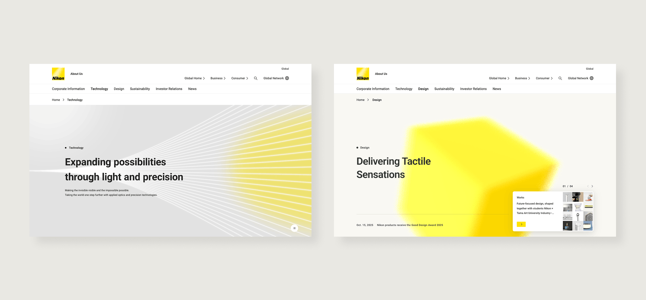
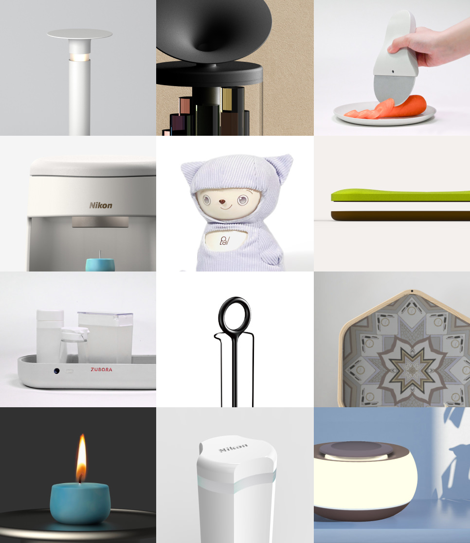
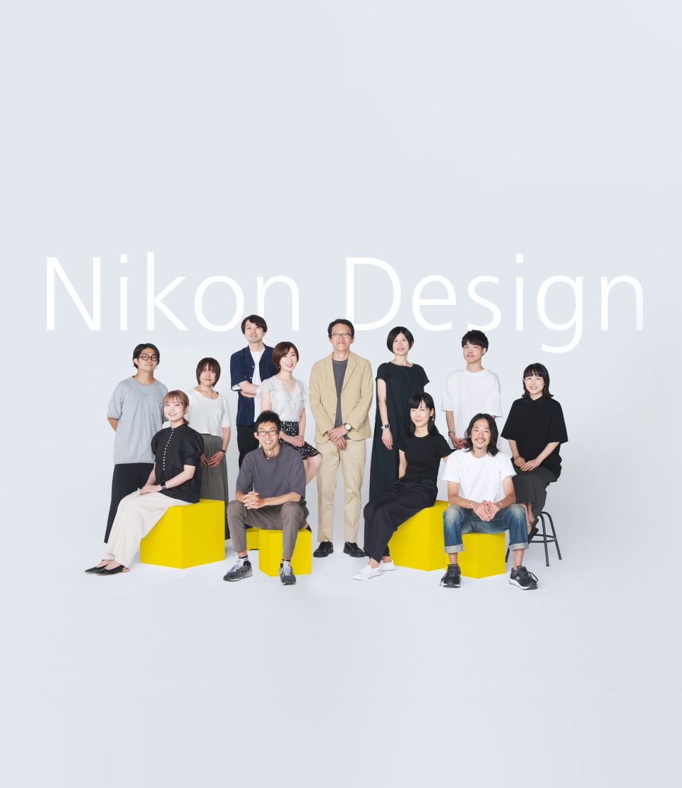
The Technology and Design pages have been renewed to more clearly convey the distinct expertise and appeal of each area. Beyond revisiting the information architecture, the renewal also involved the development of new content and improvements across multiple areas. This updated site communicates the individual appeals of technology and design more clearly and intuitively, supporting the enhancement of Nikon’s brand value. This article traces the process behind the renewal, introducing the perspectives and intentions of the teams involved.
コンポーネント番号: 9
-
Technology Page
Overall content supervision: Advanced Technology Research & Development
Project promotion: Corporate Strategy Corporate Communications Department
Visual supervision: Corporate Strategy Design Center -
Design Page
Governance management: Corporate Strategy Corporate Communications Department
Visual supervision / planning management / project promotion: Corporate Strategy Design Center
コンポーネント番号: 5
コンポーネント番号: 12
コンポーネント番号: 2
To Clearly Convey
What Makes Nikon Distinctive
コンポーネント番号: 3
This renewal was planned as an opportunity to reconsider the conventional framing of technology and
design, and to communicate Nikon’s value and appeal to a diverse range of stakeholders.
On
the Technology page, information often appeared fragmented, so it was necessary to present the
overall picture and the connections more clearly. It was therefore necessary to present the
structure and connections more clearly.
The person who supervised this page’s overall
content explains.
“We began by clearly defining who we should communicate Nikon's technology to
and what we should tell them, and then reviewed the page’s overall structure.”
Meanwhile,
the Design page was shaped by a desire to strengthen visual consistency and the messages that convey
the value of Nikon design, while also making the people working on the ground—whose presence had
been difficult to communicate through the previous page—more clearly visible. The project lead
describes it as follows.
“We aimed to renew Nikon Design so that its distinctive
characteristics would come across more clearly—showing who the people behind it are and what
motivates them. We also sought to increase Nikon Design’s connections with the wider world.”
コンポーネント番号: 4

コンポーネント番号: 3
Another team member also emphasizes the significance of the project.
“Whether or not a company
truly values design is something that naturally comes across in the way a page is put together. If
we want the designers’ intentions and values to be understood, the very structure of the page itself
has to function as a message. In that sense, this renewal carried a great deal of significance.”
コンポーネント番号: 4
コンポーネント番号: 12
コンポーネント番号: 2
From the User’s Perspective:
Deciding What to Communicate and How Users Should Feel
コンポーネント番号: 3
What should be communicated to users who visit the Technology and Design pages, and how should they
feel as a result? The project began by examining the target users from this perspective.
As
part of the corporate website, both the Technology and Design pages are intended for a broad range
of stakeholders. These include people who use or have an interest in Nikon products, business
partners, shareholders, and investors, as well as external designers and partner companies. With
this wide range of audiences in mind, further consideration was given to who each page should speak
to, and what it should convey.
The Technology page renewal lead explains the thinking
behind this approach.
“As content for the corporate and global sites, it needed to be easy to
access and easy to read for many different audiences. From there, we asked ourselves who would make
the most active use of this page. Through interviews and consultations with experts, it became clear
that the people with a strong interest in Nikon’s technology were investors and job applicants. In
particular, we wanted to make it easier for those with technical expertise and individual investors
to understand how our technologies deliver value to society.”
The Design page content
supervisor offers a similar perspective.
“When we spoke to employees who had joined Nikon
through mid-career or new-graduate recruitment, many said they had looked closely at the Design page
before applying. Based on this, we aimed to create a page that conveys the people involved in Nikon
design, the appeal of the working environment, and our past activities—so that visitors might feel
like they would want to be part of the team themselves.”
コンポーネント番号: 4

コンポーネント番号: 12
コンポーネント番号: 2
Designing Experiences
That Deliver the Message
to Users
コンポーネント番号: 3
After clarifying the target users for both the Technology and Design pages and organizing the
current issues, discussions moved on to the development of specific content.
On the
Technology page, designing content that places technology at the center required a process of
systematically organizing Nikon’s technologies. The focus was placed on reviewing information
structure and page composition, prioritizing clarity and searchability so that users can quickly
access the information they need. At the same time, information design also took into account the
completeness of the content and the relationships between individual elements.
The
rationale behind this approach is explained as follows.
“We believed it was necessary to
provide a way for people with no prior knowledge of Nikon’s technologies to grasp the overall
picture at a glance. At the same time, we systematically structured the information so that those
who wish to explore individual technologies in greater depth could do so. Through repeated team
discussions, we created an overview map that visually represents Nikon’s technology fields, from
which users can move directly to detailed articles explaining individual technologies. As a result,
we were able to visually present the overall landscape of Nikon’s technologies, while significantly
expanding the accompanying technology-related content.”
“We also put a lot of effort into
enabling cross‑category search within the site. More than a hundred articles were tagged and linked
to searchable keywords, allowing users to find information based on what they want to know. Deciding
which tags would best connect Nikon’s information with users’ interests required steady, detailed
work, but it led to a significant improvement in accessibility.”
The core message of the
Design page was developed through workshops. In addition, through the process of considering the
design concept and translating it into words and visuals, the page structure was revised with the
aim of creating content that stands out for its expertise and individuality.
The Design
lead describes this process.
“As the scope of design expanded beyond product areas such as
hardware appearance and on-screen UI to include communication with users and company-wide branding,
we engaged in extensive discussion around what message should serve as our central axis.”
The
core message ultimately adopted was ‘Delivering Tactile Sensations.’ The term ‘tactility’ was chosen
not only for its physical connotations, but also to express the way design is perceived and felt as
its scope extends beyond tangible forms.
コンポーネント番号: 5
コンポーネント番号: 12
コンポーネント番号: 2
A Key Visual
That Instantly Conveys
Nikon’s Character
コンポーネント番号: 3
Alongside information design and the close review of content, work also progressed in parallel on
the creation of key visuals for each page and the consideration of tone and manner.
The
key visual designer for the Technology page explains the concept as follows.
“We developed the
concept around an image of Nikon precisely controlling light and extending value into society and
the future, incorporating this into an animation in which lines fluctuate, converge, and expand. In
developing this concept, we were careful to maintain consistency with the Design page. While
creating an expression distinctive to Technology, we also aimed for something that conveys a
consistent brand image.”
コンポーネント番号: 5
コンポーネント番号: 4

コンポーネント番号: 3
On the Design page, a key visual based on a yellow cube inspired by Nikon's brand symbol plays an
important role.
The designer responsible for art direction explains. “The yellow cube
design, created around the core message ‘Delivering Tactile Sensations,’ changes its form and
texture in response to scrolling. It expresses an attitude of continually visualizing ideas through
the power of creativity in order to respond to each customer’s challenges and needs, and of
continuing to create the ‘tactility’ that is truly required.”
Although the motifs and
animations differ, both the Technology and Design pages are rooted in Nikon’s distinctive character.
While maintaining a unified worldview, both pages were refined repeatedly through to the final
stages of the project, eventually arriving at their current form.
コンポーネント番号: 5
コンポーネント番号: 12
コンポーネント番号: 2
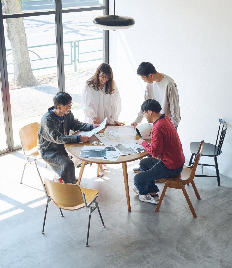
Taking Ownership Across Sections
コンポーネント番号: 3
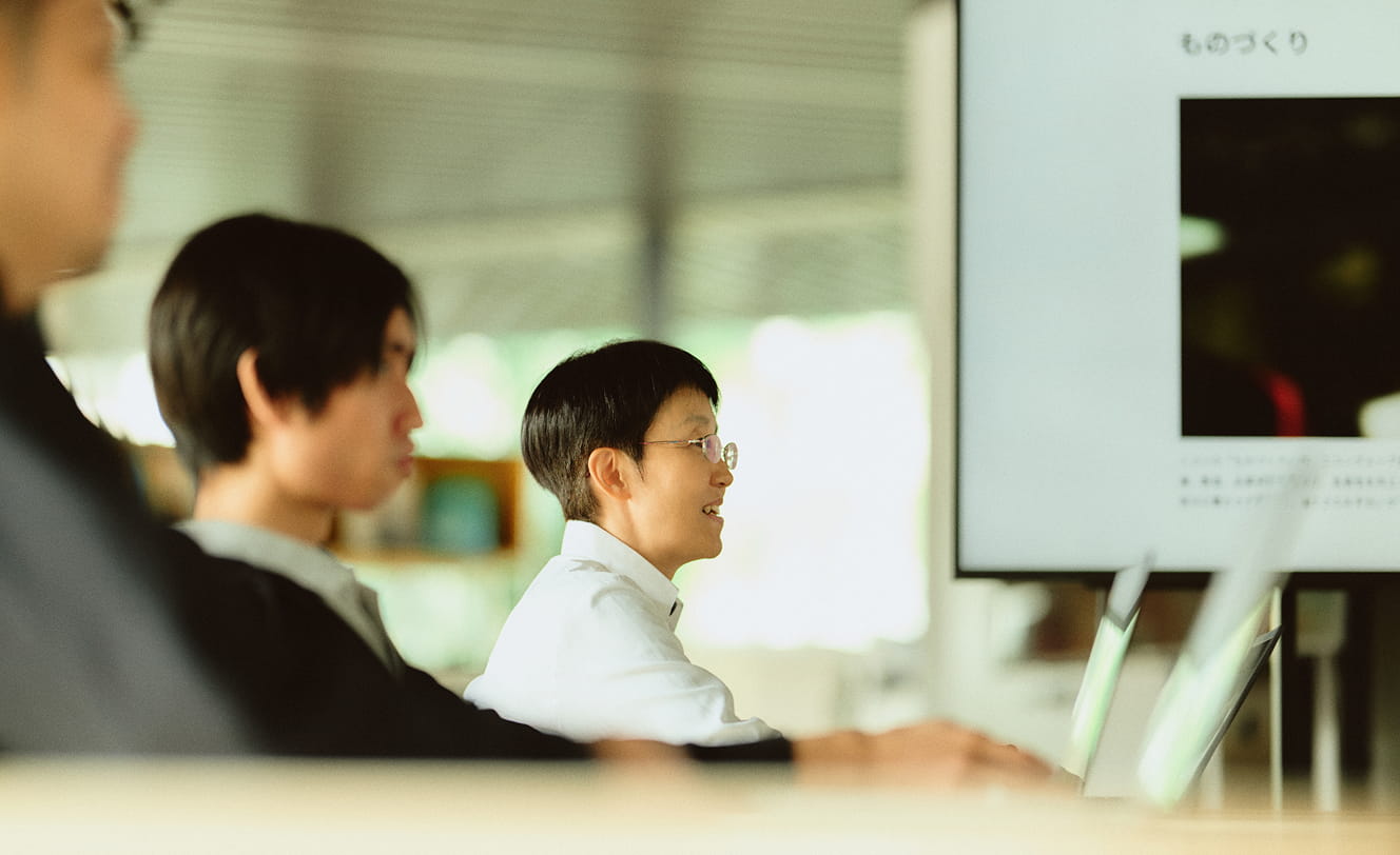
From the conceptual stage through to implementation, the team looks back on the factors that made it
possible to bring the project to a successful conclusion.
“The driving force behind the
project were the individual members of the team. It succeeded because everyone was involved with a
sense of personal ownership. As the leader responsible for driving the project forward, I often
found myself coordinating with various internal and external stakeholders. Even so, whenever issues
or requests arose, the team members consistently took the initiative to address them themselves,
which was a tremendous help.”
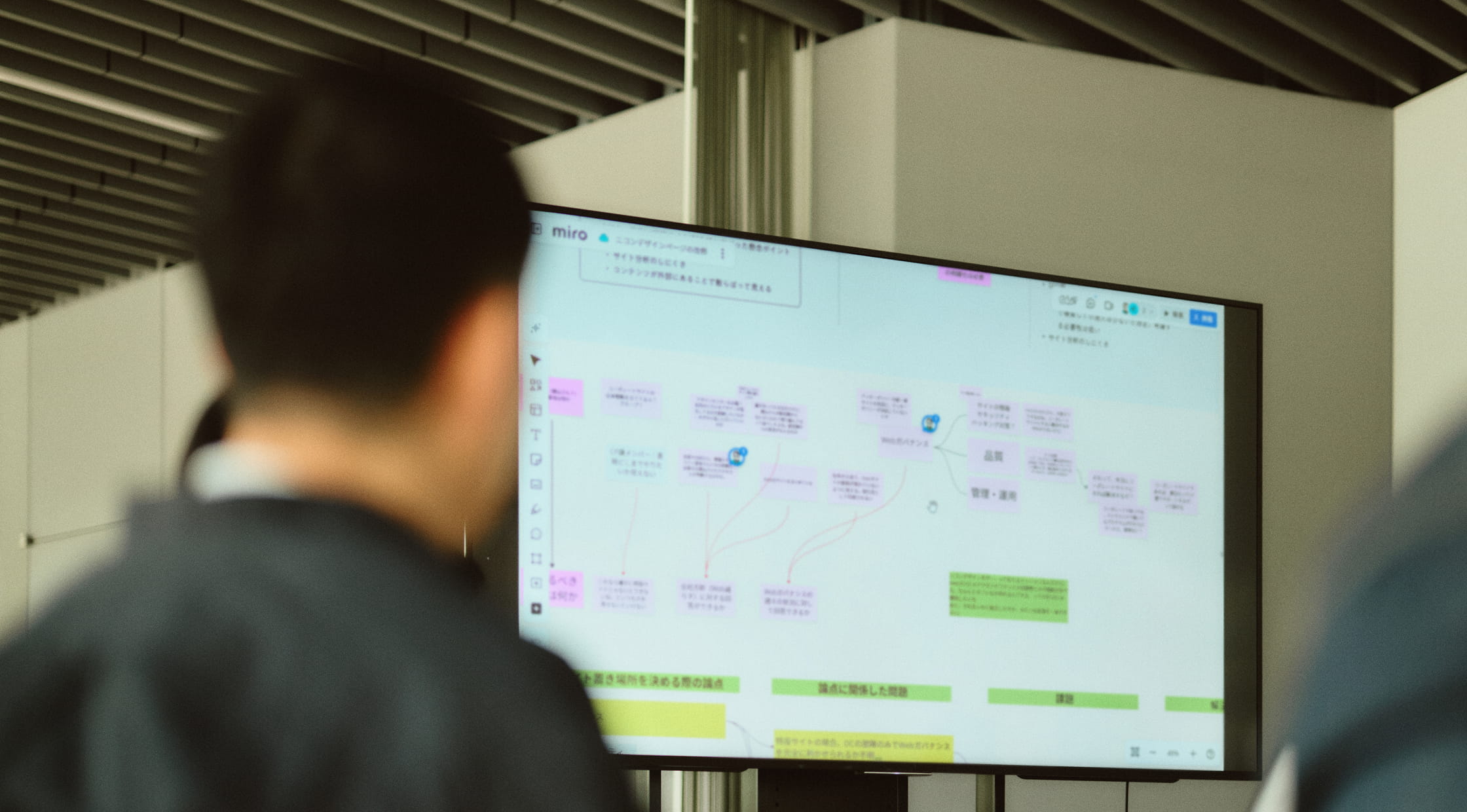
“In a good sense, it didn’t feel like we were working
within separate sections. Rather than drawing rigid boundaries around individual responsibilities,
we supported one another flexibly, and achieved great teamwork.”
“While each person
fulfilled their responsibilities within their own area of expertise, everyone was also trying to
engage with the project with a personal sense of involvement, reaching beyond their individual
domains. Without drawing strict lines between roles or departments, a very positive team dynamic
emerged. In addition, as the project moved forward through close collaboration between Technology
and Design, new horizontal connections were formed between members who would not normally interact
in their day-to-day work. This was one of the project’s significant outcomes.”
コンポーネント番号: 4

コンポーネント番号: 2
Internal and External
Responses to the Renewal
コンポーネント番号: 3
Following the renewal, a growing number of comments were received about the Technology page, noting
improvements in readability and clarity of content. The newly organized overview of Nikon’s
technologies has also found use beyond the website itself, including in event displays and
educational settings. As a result, not only has the scope of information dissemination expanded, but
the technology-related contents can now also be used more effectively.
Visible changes
were seen on the Design page, including a significant increase in access compared with before the
renewal. In addition, by articulating Nikon’s distinctiveness and translating it into visual form,
the project also contributed to establishing a clearer identity for Nikon Design. Starting from the
Design page, the same worldview has since been extended to other media, thereby strengthening the
branding of Nikon.
The response from within the company exceeded initial expectations,
with effects also seen in internal branding. Inquiries from business units regarding website
production increased, and opportunities for more casual outreach from other departments became more
frequent. There were also many responses indicating that employees had gained a clearer
understanding of the people involved in Nikon Design and the nature of their work, leading to a
sense that the expertise and appeal of Nikon Design are now being shared more widely also within the
company.
コンポーネント番号: 12
コンポーネント番号: 2
Continuing to Share
Nikon Design’s Appeal
コンポーネント番号: 3
On the Technology page, efforts will continue to focus on creating content from the user’s
perspective, making it easier for those who develop an interest to access more detailed information.
This includes strengthening pathways to the Business Customers site (currently in preparation for
release), and linking from the overview map’s technology articles to more detailed explanations and
academic papers in the Nikon Research Reports. By continuing to update content that communicates the
appeal of Nikon’s technologies, the aim is to keep sharing information that encourages professionals
with advanced technical expertise to want to work together with Nikon.
On the Design
page, we will continue to enrich content and refine communication methods so that more people can
discover the appeal of Nikon Design. Another goal is to increase the number of fans who share this
worldview. Through pages developed with close attention to detail, the team hopes to provide
opportunities for visitors to learn more about the people behind Nikon Design, the appeal of the
work environment, and the activities undertaken to date.
コンポーネント番号: 5
More Works
-
- Activity
Future-focused design, shaped together with students Nikon × Tama Art University Industry–Academia Collaboration Project
-

- Activity
Design for brand building that depicts our vision
-
- Activity
The next Nikon design: Creating new value through a future-driven mindset
-
- Activity
A groundbreaking challenge, delivering Nikon's advanced technology and next-generation solutions to more people.
-

- Product
Advancing with Traditional Design Principles: Z fc Mirrorless Camera
-
- Activity
Unique experiences collaboratively embodied by Nikon and its users
-
- Product
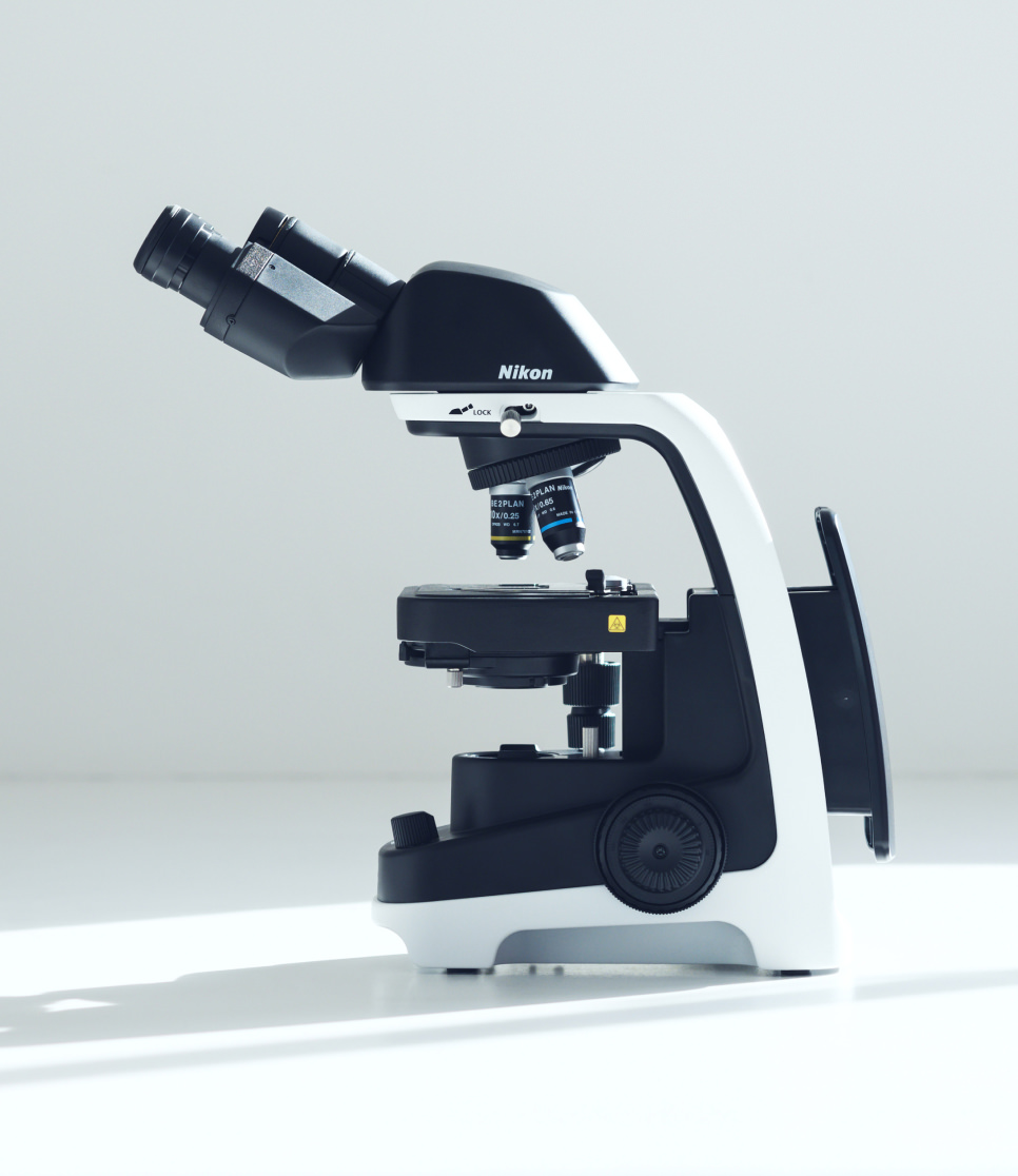
Innovative Learning with the ECLIPSE Ei Educational Microscope
-
- Product
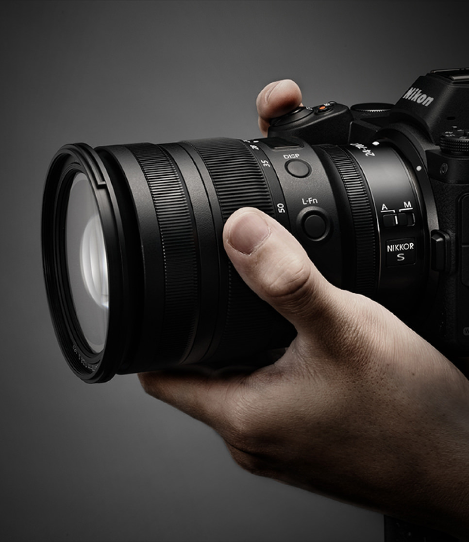
Enhancing Optical Performance with a New Dimension of Craftsmanship: NIKKOR Z Lens
-
- Product
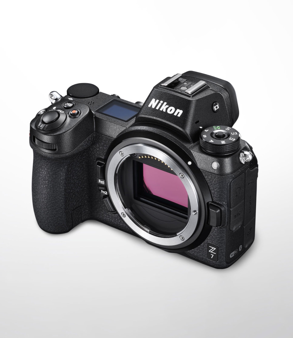
New Nikon Style Interweaving Innovation and Tradition: Z 7/Z 6
-
- Activity
Creative Skill Up: Designing our own systems and environments to enhance creative output
-
- Product
Aiding User Focus through Intuitive Operation: ECLIPSE Ti2